
At the peak of the pandemic when it became clear that we are not going to get rid of it anytime soon, public institutions became burdened by the task of providing daily information about new rules, restrictions, and guidelines for how to cope with it.
As it usually goes for the public sector, the idea might be well appreciated but the execution often trails behind. Most of the time we have gotten used to it however, with the pandemic affecting our everyday lives it became more and more vexing.
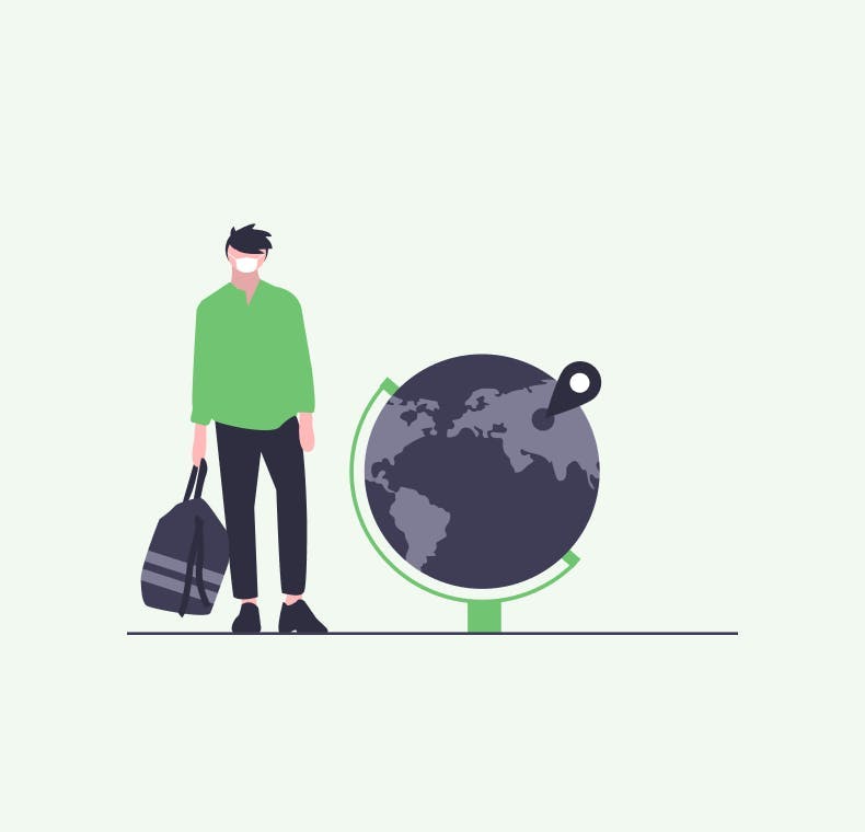
Starting point
When European Union 🇪🇺 came up with the idea to unify all the information across the member states we were really thrilled with it. With the #strongertogether hashtag they unveil their new portal. Have a look below 👇
With a strong message and a lot of useful information - this had great potential. But after seeing the final result we have decided to put it through our standard design process starting with UX research 🔎.

Do you need a reliable partner in tech for your next project?
UX Research and more
The tool informs about the current coronavirus situation in European countries in one place and keeps the data up-to-date. However, we discovered that users had trouble finding what they were looking for. We realized that the website includes too much information which, in most cases, is not clear.
In our UX research, we also saw people using the Travel ✈️ section the most. They had found this to be the number one reason why they would visit the platform. That is why we decided to focus solely on this use case and to adjust the information presented in this way.
Once we decided on the general use case we had to better understand our target audience, in order to identify what exactly they need from the product. We focused on their goals and observed behavioral patterns. Based on these we have defined user personas to cover their needs. 🙋
We have noticed that users were missing some functions in the current platform like watchdog 🐶 to be reminded about the actual status of the restrictions, ability to search for routes based on different means of transport or find specific restrictions based on the type of traveler.
After collecting all of this information we have created preliminary wireframes to be tested and edited before applying the final design. Once we had this confirmed we were ready to publish our results.
Solution
Based on all the information we gathered in our UX research we have created a simple travel app where you could search for your destination in the EU and find out all the restrictions that apply along the way.✈️ 🌍
When you are visiting a particular country you want to know the route - not just the destination. In this way the user journey follows the most common behavior and saves time spent searching for the information.
For better understanding your route at first glance we decided to implement a simple color palette. We follow the 3 categories already created and used by re-open the EU platform and applied them to our use case.
We also included most of the features to further complete the user journey. To make sure user has always up to date information we introduced a watchdog 🐶 that you ca set-up as in-browser notifications 🔔 or via email. 📧
We have tested our concept with users and they loved it. ♥️
Everything is much more clearer comparing to the current platform. From finding your route to getting notified about restrictions, it is faster and much smoother.
If you want to know more about the process or want to give us feedback check out out case study on Behance
Implications and outcome
After we have completed and shared our version we got really positive feedback within our community. Therefore we have decided to contact EU representatives and present them our ideas since as they have put it we are #strongertogether.
We have sent them an email with our solution explaining the reasoning and the whole process behind it. After some time after sending the email, we have noticed that the https://reopen.europa.eu/ portal introduced a new functionality - Travel plan.
Here is a little sample of the theor implementation.👇
When we forget about UI :smirk: and focus solely on the functional of the feature it accomplished the basic idea we had set out to do. So good job EU for listening to our feedback! 🎉
Once the Travel Plan has been published we even got a response email from the team behind Re-open Europe. They piqued our interest by explaining a few behind-the-scenes obstacles that they have to deal with while building this feature.
“Due to the high number of variables, individual situations and fragmentation of rules, it is nearly impossible to offer concise sentences describing the restrictions in place”
When we hear that something can't be done, we see it as an opportunity for creativity, therefore we agreed to schedule a call with the EU team 🇪🇺 to get to the bottom of this and make the portal better for all of us.
Share post
Let’s stay connected
Do you want the latest and greatest from our blog straight to your inbox? Chuck us your email address and get informed.
You can unsubscribe any time. For more details, review our privacy policy
Related posts

03 January 2023
UX Case study: Order products from the cafe in advance
design
figma
UX Case study
03 January 2023
UX Case study: Order products from the cafe in advance
design
figma
UX Case study